Creative Commons

Our research is free for anyone to use. However, we wanted a clear way to express this. Creative Commons is a nonprofit that licenses your research and pictures. When choosing which license, I chose attribution. Put simply, anyone can use our research as long as they give us credit.

Creative Commons does an excellent job of making their site user friendly. The process was simple and easy. I clicked the “Share your work” tab at the top, and filled out the questionnaire. When I was finished they gave me code and told me to post it on our site. At first, I put this on our homepage However, it just looked like code. After a little more trial and error, I put it in the “text” option in the footer of our site. After I did this, the code became a clickable Creative Commons link. Overall, I am very impressed with Creative Commons and highly recommend them for anyone who is trying to license their work.

Building our Site

When deciding what pages to include in our Menu, I had to really think about what pages are on regular websites. I decided that Our Mission Statement should be a our homepage so that when you arrive at our site, you know about our project and our goals. I revised the mission statement several times and finally decided upon the finished product you see now.

My second thought was having a page explaining what exactly we mean by Language Maps and Language Clouds. Dr. Quizon thankfully authored this page with working links.

As a team, we decided to rename the blog page to “The Project”. This was a unanimous decision. We wanted to take people step by step through our process.

Our “Contact Us” page is for anyone who has questions, comments, or wants to use our research which is covered by Creative Commons. The “Contribute” page will be an open forum for anyone who would like to add their languages to our research. We are working now with a WordPress expert who is going to build our questionnaire which will input directly into an Microsoft Excel spread sheet, already coded.

We encourage you to check back soon and contribute your own languages!

The Best and Worst Functions of WordPress

In my opinion, the best function of WordPress is the edit shortcut when you visit your site. This is extremely helpful in the final stages of production because you can view your site, catch a typo or another minor problem, and hit edit. This takes you back to that page or post on that dashboard. It eliminates several steps that you would have to do without this shortcut making editing fast and easy.

edit

The worst function of WordPress is not being able to save a draft of a page. Being a student, I would work on the blog at odd times, sometimes in between classes. Even though a page I was working on was not ready to be viewed by the public, I would have to Publish it just to save my progress. I am a bit of a perfectionist so I found this frustrating to Publish and incomplete version.

publish

Choosing a Blog Theme

Personally, I think my biggest obstacle with creating the blog was choosing a theme. WordPress has many options, so finding a theme wasn’t the problem, finding one that had all the capabilities I wanted was. The first theme I picked which I really liked was called “Vertex”. But there were a few features that I wasn’t thrilled about. First, it took the secondary title “A TLTC Blog” and made it look like button. However, if you clicked on it nothing happened. This was a bit misleading for our viewers. This button was also in the center of our blog page and there was no way to move it, edit it, or delete it.

The second problem with this theme was that it didn’t have an option for a header image. When I first picked this theme, I thought that blank space at the top included the header image but it didn’t.

Here is an example of the blog that I didn't like. As you can see, the red bar looks like a button and I couldn't change the image of the clouds.
Here is an example of the blog that I didn’t like. As you can see, the red bar looks like a button and I couldn’t change the image of the clouds.

After some search, I found “Accelerate blog theme to be clean and user friendly. I was also with the rest of the research team when I chose the theme so it was nice to have their thoughts as well.

The Best and Worst of Viewshare

Viewshare was pretty awesome the first time around. The best part of it was the map that was auto created. Not only did it show the plotted points but by hovering over the points you can see more specific things (such as which person reported speaking a language) and by clicking on that person’s randomized ID number, you could see all the details of their entry.

However, the amazement soon fell away after I took down the data to make adjustments.viewshare-map The second time around, I could not re-upload the files. We lost all the visuals from the first data set and we could not recover it. According to the site, the file was corrupted. Luckily the second data set went up with only a few minor problems; the map was generated and any other issues, I was able to fix quickly.

Overall Viewshare is not too bad; it could be even better if you are usingviewshare-pie-chart smaller and simpler data sets. The map and charts, when functioning properly, are very user friendly and interactive which was our main goal when presenting our data.

Using Viewshare

ViewShare is a website in which people can input a selection of data, like an excel chart, and the program will allow the person to create different charts, maps, lists and timelines, depending on what kind of information the program can read from the data. Professor Quizon set up the account and I, Ellie Hautz, explored it’s features with a mock Microsoft Excel spreadsheet to see how we could use ViewShare in our research. We all worked on coding the information onto the Microsoft Excel file. I took the final version and uploaded it to ViewShare to see what I could do with it. I was so excited to see the amount of charts I could make with it. I looked at the map portion and it had plotted points that I had not intended it to. For instance our version of New York was specifying New York, NY. However, the program read it as New York in the United Kingdom. So I thought that maybe putting in coordinates would plot easily. I then had a discussion with the group to decided what coordinates we were going to use. We decided that for everyone using North New Jersey English would be based on Bergen County and South New Jersey English would be Cape May County since they were the most coastal north and the most coastal south.The majority of our participants were from New Jersey. However, a good deal of participants indicated other states our countries. For plotting these, we decided to use the capital of the state or country origin of the language unless otherwise specified by the participant. So I made an extra section of my own Microsoft Excel spreadsheet with the coordinates for these areas, however, it still was not working properly. I looked closely and the program asked for the city and state and/or country of each data point. So I went through again and used the capital of every county, state, and country. Finally it worked and the map plotted correctly.

Unfortunately, after a week or so of the corrected data, ViewShare stopped being compatible with our first set of data.

Place names: New Jersey/New York to global speech communities

Our team member Ellie Hautz was tasked with figuring out how to map place names that were provided as regional descriptors for a language. In a sense, individuals were identifying where a particular speech community lives, either as a result of their own lived experience or inferred from information shared by others. The map that this query generates is quite distinct:  using Viewshare we see a wider and richer distribution, encompassing both the perceived geographical origins of a language but also the location of speech communities as witnessed or inferred by our respondents.

One of the most interesting decisions made by the team was how to capture the high incidence of descriptors for New Jersey and New York varieties of English. Viewshare required specific latitude/longitude codes in order to generate a map. As a New Jersey-based university, our team felt obliged to step up to the richness of the local data before us. After exploring various strategies, we decided to adapt principles used in Rick Aschmann’s American Dialects website. Like Aschmann’s site as well as the broader literature on English dispersal in the US, we used the Eastern seaboard as starting point. cropped-DH1Language-City-PackedBubbles-1.pngHowever, to graphically capture what our respondents refer to as “northern NJ,” we decided to map it onto New Jersey’s northernmost seaside county (Bergen) with the capital city of Hackensack. Similarly, verbatim descriptors of “southern NJ” were mapped onto the southernmost seaside county (Cape May) with the same-named capital city.  Aschmann used slightly different terms, however, because he was plotting nationally beyond a single state. For purposes of this specific data set, what appears elsewhere as “Inland North” was coded as “Northern NJ”; what is referred to elsewhere as Atlantic Midland is what was coded as “Southern NJ.” Whenever New York was mentioned, the variety descriptor  “Greater New York City” was used.

Interestingly, our college campus is located in Essex County, NJ located in a geographical region that falls somewhere at the cusp of the language varieties of Northern NJ/Inland North as well as Greater New York City.

How Do You Say…’Hello’?

In gathering our data, we have recorded many different languages. Here is how you say hello in some of them!

English ~ Hello/Hi

Italian ~ Ciao

German ~ Hallo

French ~ Bonjour

Tagalog ~ Kamusta

Spanish ~ Hola

Russian ~ Здравствуй   (Zdravstvuy) 

Welch ~ Helo

Dutch ~ Hoi

Japanese ~ こんにちは  (Kon’nichiwa)

Korean ~안녕   (annyeong)

Polish ~  cześć

Gaelic ~ Haigh

Portuguese ~ Oi

Chinese (Cantonese/Mandarin) ~  你好  Nǐ hǎo

greeting-2

Microsoft Excel: Randomized Number I.D. for Participants

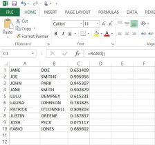
In order to present our data by the participant, the ethical thing was to avoid revealing the actual name of the individuals who gave us our data. In this, we used Microsoft Excel to generate and assign random numbers, rather than simply numbering every subject individually. These numbers would then act as the I.D.’s for each participant. On a separate spreadsheet, we put participants first and last names in columns ‘A’ and ‘B’ respectively (here I have put in ten fake names* to show you an example). For our data, we had a list of all the participants’ names in alphabetical order by last name.

random-number-excel-part-3

Next, I used the RAND, or random function. By putting the =RAND() function into column ‘C’ from cells C1 to C10, we were given a random decimal number. Then, I had tried to use the =RANDBETWEEN function in column ‘D’, inputting =RANDBETWEEN(1,10). Although this gave us a random whole number between 1 and 10, there were repeats of the same number. So now one of the biggest problems was finding a way to have excel create random intergers that did NOT repeat.

random-number-excel-part-2

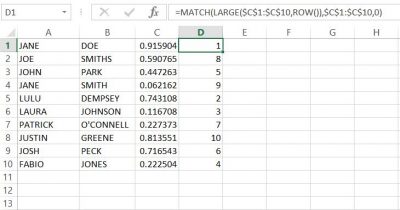
Finally, with a little help from the library and the internet, I used the following formula to generate NON-REPEATING whole numbers in column ‘D’;
=MATCH(LARGE($C$1:$C$20,ROW()),$C$1:$C$20,0)


The result was what we were looking for, anonymity for our participants. With this success, we copied and pasted the numbers next to the names in the list of participants in our data set.**

random-number-excel-part-1

*None of these names are meant to have any relation to any person(s) alive or deceased.
**When I input the function into column ‘D’, the random values in column ‘C’ changed automatically, but remained random. you need to keep this formula in this column in order for the function in ‘D’ to work.


There may be other ways of achieving the same outcome, but this formula worked best in excel.

Microsoft Excel vs. Google Sheets: Which One Did We Choose?

Initially, we were going to use Google’s spreadsheet because we could all edit it in one place, but we encountered a few problems. Some of the data in the Microsoft Excel spreadsheet when opened in the Google spreadsheet would overlap into other columns, making it hard to read. Additionally, there would be the occasion where data that was present in the Excel sheet was missing in Google’s spreadsheet. As another point, we all had the same version (2013) of Microsoft Excel  pre-downloaded on our laptops which made Microsoft Excel compatibility easy. It was unanimously decided that we use Microsoft Excel to input data. However, we also decided to use Google Drive to save and share our data on a cloud. Google Drive also updated us via email anytime one of us contributed to our shared folder.

We created three folders in google docs to organize our saved spreadsheets and other files. These three were ‘1st DH Raw Data’, ‘2nd DH Raw Data’, and ‘DH Meeting Docs’. The third folder held our meeting minutes, or what our discussions were when we met and what goals we discussed to have done before we next met. Both the first and second raw data folders had sub folders of ‘checked’ and ‘unchecked’, where the previously naming convention came in handy. Additionally, both raw data set folders had their respective index card scanned copies were saved there. In doing this, we kept all files organized well and were able to share files efficiently. Although we all saved the most recent files to our desktops and to a shared USB drive for backup, Google Drive assured that our updated and previous files were in one place that we could all access from any computer.

Our Naming Convention and Communication

All data we entered had to not only be divided evenly among the team, but it also needed to be checked to make sure that the information is correct and who had last saved the data. We agreed to use an author naming convention by using our initials. In the Microsoft Excel spreadsheets, we designated four additional columns for this purpose, and two more columns were added to communicate on the spreadsheet itself. Columns D,E, R, S, T, and U were used for the following: D was ‘Entered by CQ/MP/AB/EH’, E was ‘Date Entered’, R was ‘Comments’, S was ‘Checked by CQ/MP/AB/EH’, T was ‘Date Checked’, and U was ‘Additional Notes’.  The ‘Comments’ column was used to communicate changes to data. Say I had entered a name wrong as ‘McThomas’, but Michelle caught the mistake, and would write in that row under column R ‘MP-AB fixed last name to MacThomas’. This tells us that Michelle is writing to Anastasia (me) that she fixed the error in the last name I made. If we had a question or were not sure of a data entry or part of one, we would write in column R as well. For example, if Ellie had a question about  a missing name, she could write in the ‘Comments’ column ‘Which participant is this?’ or simply state ‘No name given’.

The initial convention was used not only to show who input and checked the data, but also who had last saved the data. To give an example, if I was the first to put in data, I would label the newly saved excel sheet ‘AB Raw Data Set 1’.  If Ellie was the next to input her data and check mine, the new excel sheet would be titled and saved as ‘AB-EH Raw Data Set 1’. Then, if Michelle were to do the same, the file would be saved as ‘AB-EH-MP Raw Data Set 1’. This naming method would continue until all data is input and checked.

Overall, this system of using our initials to know who last saved, checked, and input data worked very well. It was a simple, clear way to know among the team who had last saved the most recent data and who was communicating with who within the spreadsheet, especially between meetings.

The Coding Process

The Coding Process

As of July, our research interns officially began coding the data extracted from the note cards.

The first step was moving all the raw data information from the individual note cards to an Excel spreadsheet. Once we finished transcribing the data verbatim from the cards, we noticed that the individual descriptors on each card would make coding the spreadsheet difficult. What undoubtedly made the cards unique, also made them so versatile that coming up with a coding system would be an ambitious task. We wanted to keep the authenticity of the raw data while also coding the entries in an easily understood manner, making it significantly easier for us to plot.

[box] Here are the unique descriptors that students wrote on their note cards. [/box]

Before establishing the coding system, we had to answer some questions: If the language is Spanish, but the card identifies The Dominican Republic or Puerto Rico, do we code that region as Spain or as the other two countries? What can we assume from the cards if we can assume anything? Since each research intern takes part in all steps of the process, establishing a concise coding system is essential so that every card is coded the same way.

Generally, the beginning of our research meetings are spent discussing any coding problems that come up. We are currently still coding the First Data Set and have started coding the Second Data Set.


The Origin of the Project

In the Fall 2015 Linguistic Anthropology class taught by Dr. Quizon, students were asked to share information about any and all languages that they knew. She gave out note cards and instructed the class to write down one language per card. Underneath the name of the language, they were asked to write down anything they wished to say about this language. They used descriptors of their own design making these cards rich with open-ended qualitative data. On the reverse of each card, they were asked to write their names.

With support from Seton Hall’s Digital Humanities Fellowship initiative, Dr. Quizon and three student interns who completed the course in the previous semester took a closer look at this data and explored ways to visualize the information. Were there intriguing or interactive ways to plot linguistic information? Could the data be mapped? Were there patterns to be discovered when expressed in visual form?

The class of 35 students was surveyed twice: once in the beginning of the semester, and again towards the end of the semester. The Language Maps, Language Clouds research team took these two sets of note cards, devised ways to capture, organize and analyze the information using linguistic concepts, explored ways to visualize the results of our queries, and aimed to share our findings online. Our goal is to share both processes and results as we seek to deepen our understanding of the data an interesting, interactive setting.

Even though we all participated in every aspect of the project, we each had an area of expertise. Ellie learned how to use and troubleshoot Viewshare and later, with Dr. Quizon, explored Tableau. She worked with Anastasia who was in charge of Excel and added knowledge of its features as needed for the project. I was in charge of learning how to build a blog on WordPress.