Creative Commons

Our research is free for anyone to use. However, we wanted a clear way to express this. Creative Commons is a nonprofit that licenses your research and pictures. When choosing which license, I chose attribution. Put simply, anyone can use our research as long as they give us credit.

Creative Commons does an excellent job of making their site user friendly. The process was simple and easy. I clicked the “Share your work” tab at the top, and filled out the questionnaire. When I was finished they gave me code and told me to post it on our site. At first, I put this on our homepage However, it just looked like code. After a little more trial and error, I put it in the “text” option in the footer of our site. After I did this, the code became a clickable Creative Commons link. Overall, I am very impressed with Creative Commons and highly recommend them for anyone who is trying to license their work.

Building our Site

When deciding what pages to include in our Menu, I had to really think about what pages are on regular websites. I decided that Our Mission Statement should be a our homepage so that when you arrive at our site, you know about our project and our goals. I revised the mission statement several times and finally decided upon the finished product you see now.

My second thought was having a page explaining what exactly we mean by Language Maps and Language Clouds. Dr. Quizon thankfully authored this page with working links.

As a team, we decided to rename the blog page to “The Project”. This was a unanimous decision. We wanted to take people step by step through our process.

Our “Contact Us” page is for anyone who has questions, comments, or wants to use our research which is covered by Creative Commons. The “Contribute” page will be an open forum for anyone who would like to add their languages to our research. We are working now with a WordPress expert who is going to build our questionnaire which will input directly into an Microsoft Excel spread sheet, already coded.

We encourage you to check back soon and contribute your own languages!

The Best and Worst Functions of WordPress

In my opinion, the best function of WordPress is the edit shortcut when you visit your site. This is extremely helpful in the final stages of production because you can view your site, catch a typo or another minor problem, and hit edit. This takes you back to that page or post on that dashboard. It eliminates several steps that you would have to do without this shortcut making editing fast and easy.

edit

The worst function of WordPress is not being able to save a draft of a page. Being a student, I would work on the blog at odd times, sometimes in between classes. Even though a page I was working on was not ready to be viewed by the public, I would have to Publish it just to save my progress. I am a bit of a perfectionist so I found this frustrating to Publish and incomplete version.

publish

Choosing a Blog Theme

Personally, I think my biggest obstacle with creating the blog was choosing a theme. WordPress has many options, so finding a theme wasn’t the problem, finding one that had all the capabilities I wanted was. The first theme I picked which I really liked was called “Vertex”. But there were a few features that I wasn’t thrilled about. First, it took the secondary title “A TLTC Blog” and made it look like button. However, if you clicked on it nothing happened. This was a bit misleading for our viewers. This button was also in the center of our blog page and there was no way to move it, edit it, or delete it.

The second problem with this theme was that it didn’t have an option for a header image. When I first picked this theme, I thought that blank space at the top included the header image but it didn’t.

Here is an example of the blog that I didn't like. As you can see, the red bar looks like a button and I couldn't change the image of the clouds.
Here is an example of the blog that I didn’t like. As you can see, the red bar looks like a button and I couldn’t change the image of the clouds.

After some search, I found “Accelerate blog theme to be clean and user friendly. I was also with the rest of the research team when I chose the theme so it was nice to have their thoughts as well.

Using Viewshare

ViewShare is a website in which people can input a selection of data, like an excel chart, and the program will allow the person to create different charts, maps, lists and timelines, depending on what kind of information the program can read from the data. Professor Quizon set up the account and I, Ellie Hautz, explored it’s features with a mock Microsoft Excel spreadsheet to see how we could use ViewShare in our research. We all worked on coding the information onto the Microsoft Excel file. I took the final version and uploaded it to ViewShare to see what I could do with it. I was so excited to see the amount of charts I could make with it. I looked at the map portion and it had plotted points that I had not intended it to. For instance our version of New York was specifying New York, NY. However, the program read it as New York in the United Kingdom. So I thought that maybe putting in coordinates would plot easily. I then had a discussion with the group to decided what coordinates we were going to use. We decided that for everyone using North New Jersey English would be based on Bergen County and South New Jersey English would be Cape May County since they were the most coastal north and the most coastal south.The majority of our participants were from New Jersey. However, a good deal of participants indicated other states our countries. For plotting these, we decided to use the capital of the state or country origin of the language unless otherwise specified by the participant. So I made an extra section of my own Microsoft Excel spreadsheet with the coordinates for these areas, however, it still was not working properly. I looked closely and the program asked for the city and state and/or country of each data point. So I went through again and used the capital of every county, state, and country. Finally it worked and the map plotted correctly.

Unfortunately, after a week or so of the corrected data, ViewShare stopped being compatible with our first set of data.

The Coding Process

The Coding Process

As of July, our research interns officially began coding the data extracted from the note cards.

The first step was moving all the raw data information from the individual note cards to an Excel spreadsheet. Once we finished transcribing the data verbatim from the cards, we noticed that the individual descriptors on each card would make coding the spreadsheet difficult. What undoubtedly made the cards unique, also made them so versatile that coming up with a coding system would be an ambitious task. We wanted to keep the authenticity of the raw data while also coding the entries in an easily understood manner, making it significantly easier for us to plot.

[box] Here are the unique descriptors that students wrote on their note cards. [/box]

Before establishing the coding system, we had to answer some questions: If the language is Spanish, but the card identifies The Dominican Republic or Puerto Rico, do we code that region as Spain or as the other two countries? What can we assume from the cards if we can assume anything? Since each research intern takes part in all steps of the process, establishing a concise coding system is essential so that every card is coded the same way.

Generally, the beginning of our research meetings are spent discussing any coding problems that come up. We are currently still coding the First Data Set and have started coding the Second Data Set.


The Origin of the Project

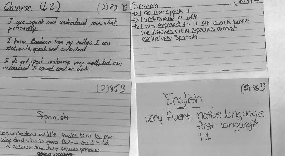
In the Fall 2015 Linguistic Anthropology class taught by Dr. Quizon, students were asked to share information about any and all languages that they knew. She gave out note cards and instructed the class to write down one language per card. Underneath the name of the language, they were asked to write down anything they wished to say about this language. They used descriptors of their own design making these cards rich with open-ended qualitative data. On the reverse of each card, they were asked to write their names.

With support from Seton Hall’s Digital Humanities Fellowship initiative, Dr. Quizon and three student interns who completed the course in the previous semester took a closer look at this data and explored ways to visualize the information. Were there intriguing or interactive ways to plot linguistic information? Could the data be mapped? Were there patterns to be discovered when expressed in visual form?

The class of 35 students was surveyed twice: once in the beginning of the semester, and again towards the end of the semester. The Language Maps, Language Clouds research team took these two sets of note cards, devised ways to capture, organize and analyze the information using linguistic concepts, explored ways to visualize the results of our queries, and aimed to share our findings online. Our goal is to share both processes and results as we seek to deepen our understanding of the data an interesting, interactive setting.

Even though we all participated in every aspect of the project, we each had an area of expertise. Ellie learned how to use and troubleshoot Viewshare and later, with Dr. Quizon, explored Tableau. She worked with Anastasia who was in charge of Excel and added knowledge of its features as needed for the project. I was in charge of learning how to build a blog on WordPress.