Microsoft Excel vs. Google Sheets: Which One Did We Choose?

Initially, we were going to use Google’s spreadsheet because we could all edit it in one place, but we encountered a few problems. Some of the data in the Microsoft Excel spreadsheet when opened in the Google spreadsheet would overlap into other columns, making it hard to read. Additionally, there would be the occasion where data that was present in the Excel sheet was missing in Google’s spreadsheet. As another point, we all had the same version (2013) of Microsoft Excel  pre-downloaded on our laptops which made Microsoft Excel compatibility easy. It was unanimously decided that we use Microsoft Excel to input data. However, we also decided to use Google Drive to save and share our data on a cloud. Google Drive also updated us via email anytime one of us contributed to our shared folder.

We created three folders in google docs to organize our saved spreadsheets and other files. These three were ‘1st DH Raw Data’, ‘2nd DH Raw Data’, and ‘DH Meeting Docs’. The third folder held our meeting minutes, or what our discussions were when we met and what goals we discussed to have done before we next met. Both the first and second raw data folders had sub folders of ‘checked’ and ‘unchecked’, where the previously naming convention came in handy. Additionally, both raw data set folders had their respective index card scanned copies were saved there. In doing this, we kept all files organized well and were able to share files efficiently. Although we all saved the most recent files to our desktops and to a shared USB drive for backup, Google Drive assured that our updated and previous files were in one place that we could all access from any computer.

The Coding Process

The Coding Process

As of July, our research interns officially began coding the data extracted from the note cards.

The first step was moving all the raw data information from the individual note cards to an Excel spreadsheet. Once we finished transcribing the data verbatim from the cards, we noticed that the individual descriptors on each card would make coding the spreadsheet difficult. What undoubtedly made the cards unique, also made them so versatile that coming up with a coding system would be an ambitious task. We wanted to keep the authenticity of the raw data while also coding the entries in an easily understood manner, making it significantly easier for us to plot.

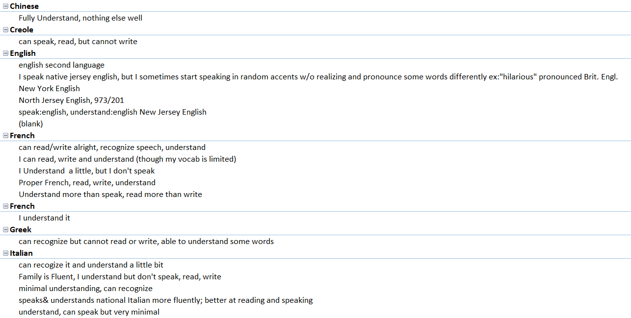
[box] Here are the unique descriptors that students wrote on their note cards. [/box]

Before establishing the coding system, we had to answer some questions: If the language is Spanish, but the card identifies The Dominican Republic or Puerto Rico, do we code that region as Spain or as the other two countries? What can we assume from the cards if we can assume anything? Since each research intern takes part in all steps of the process, establishing a concise coding system is essential so that every card is coded the same way.

Generally, the beginning of our research meetings are spent discussing any coding problems that come up. We are currently still coding the First Data Set and have started coding the Second Data Set.


The Origin of the Project

In the Fall 2015 Linguistic Anthropology class taught by Dr. Quizon, students were asked to share information about any and all languages that they knew. She gave out note cards and instructed the class to write down one language per card. Underneath the name of the language, they were asked to write down anything they wished to say about this language. They used descriptors of their own design making these cards rich with open-ended qualitative data. On the reverse of each card, they were asked to write their names.

With support from Seton Hall’s Digital Humanities Fellowship initiative, Dr. Quizon and three student interns who completed the course in the previous semester took a closer look at this data and explored ways to visualize the information. Were there intriguing or interactive ways to plot linguistic information? Could the data be mapped? Were there patterns to be discovered when expressed in visual form?

The class of 35 students was surveyed twice: once in the beginning of the semester, and again towards the end of the semester. The Language Maps, Language Clouds research team took these two sets of note cards, devised ways to capture, organize and analyze the information using linguistic concepts, explored ways to visualize the results of our queries, and aimed to share our findings online. Our goal is to share both processes and results as we seek to deepen our understanding of the data an interesting, interactive setting.

Even though we all participated in every aspect of the project, we each had an area of expertise. Ellie learned how to use and troubleshoot Viewshare and later, with Dr. Quizon, explored Tableau. She worked with Anastasia who was in charge of Excel and added knowledge of its features as needed for the project. I was in charge of learning how to build a blog on WordPress.