
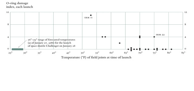
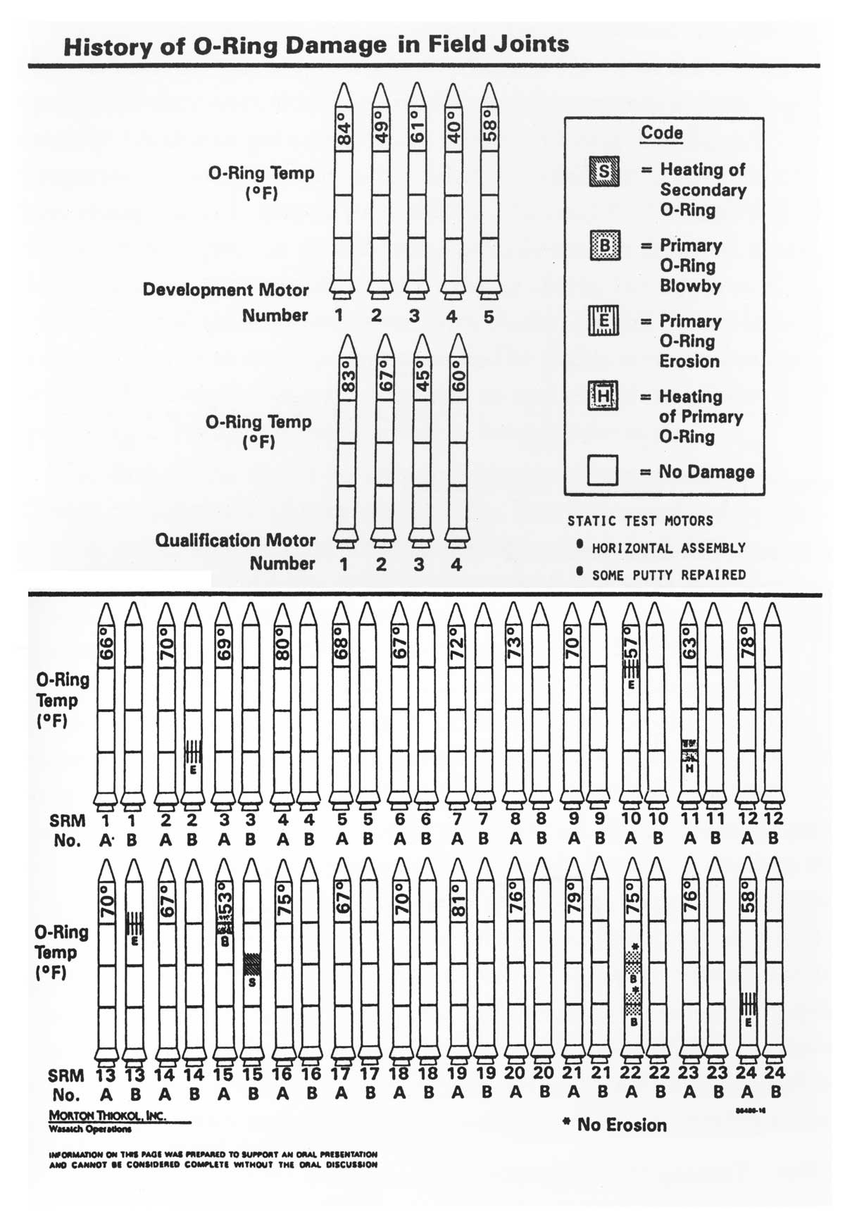
Seeing is believing. Or is it? Take a look at the graphic below. See if all those little cartoon rockets vividly predict the increasing likelihood of the 1986 space shuttle disaster (as temperatures dropped) from failure of the Challenger’s O-rings. (Click to enlarge)
Now look at an updated version. The warning almost jumps off the graphic. (Click to enlarge)
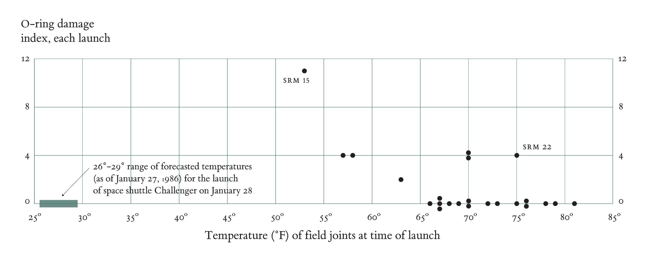
The immediacy of the insight provided by depicting the same information in an easier-to-understand way also provides a sharp picture of the value of the new discipline called data visualization.
And here’s something else that should become instantly clear: Seton Hall University aims to be an academic leader in this nascent field. This fall, the Department of Psychology will collaborate with the Department of Mathematics and Computer Science to inaugurate a unique certificate program called Data Visualization and Analysis (DAVA).
As Kelly M. Goedert, an associate professor of psychology and human cognition expert, sees it, DAVA will help tame the growing complexity of modern life. The idea is to give decision-makers the tools to more quickly and accurately see the forest and not just the trees. “We are living in an age when we have so much data,” she says. “The biggest problem is organizing it and understanding it.”
Providing a list of potential beneficiaries is fellow DAVA organizer Manfred Minimair, associate professor in the Department of Mathematics and Computer Science. (Susan Nolan, chair of the Department of Psychology, is another co-founder of the program.)
“Doctors and healthcare professionals, for example, want to assess the effectiveness of treatments based on conflicting data from different studies,” Minimair notes. “Marketing analysts study online social networks in order to provide the foundations for new marketing campaigns. And financial analysts want to understand the relationships among different stock prices and economic indicators, and all pretty much in real time.”
Another application is in law enforcement, which has been especially recognized in the wake of the 9/11 terrorist attacks. Many observers argued that American intelligence agencies had plenty of data to see what was coming. But they simply couldn’t connect the dots among them, much less draw them.
Minimair recently helped the New Jersey State Police track the movements and growth of street gangs through online tools that put data from a gang activity survey into graphically interactive representation. The State Police had been publishing comprehensive reports using this data, he notes, but found those reports were too detailed and voluminous to be useful for the general public. The resulting interactive “bubble chart” allows users to look at information from the study in many different ways, with each municipality represented by a circle of varying sizes, depending on the information being conveyed. “It shows, for example, that East Orange is actually a larger center for gang activity than Newark,” Minimair says.
“After the next survey is taken in 2013, new data visualization tools might be able to show historic trends and model predictions,” says State Police intelligence analyst Peter Lynch. But already, the project allows a whole new way for people to view, explore and manipulate the data, while allowing police officers to better focus their efforts.
Fellow intelligence analyst Dean Baratta says the new graphics are much more accessible than the former two-dimensional color maps and 100-page report. A town official can now know at a glance how gang activity in his town compares with surrounding or similar-size municipalities.
Data visualization not only allows people to see multiple variables at once, notes Goedert, but it also allows them to interact with the data to tease out new patterns. And, as she explains, there is a whole science around data cognition that encompasses everything from colors to phrasing. It includes recognizing that black-on-white charts are the most readable, and that people grasp the meaning of “one in 10 people” faster than the phrase “10 percent of a population.”
Put another way, the DAVA program should allow students to not only quickly see and interpret the meaning from oceans of data, but be able to explain the inferences more succinctly.
– Bob Gilbert is a freelance writer based in Connecticut.