Viewshare was pretty awesome the first time around. The best part of it was the map that was auto created. Not only did it show the plotted points but by hovering over the points you can see more specific things (such as which person reported speaking a language) and by clicking on that person’s randomized ID number, you could see all the details of their entry.
However, the amazement soon fell away after I took down the data to make adjustments. The second time around, I could not re-upload the files. We lost all the visuals from the first data set and we could not recover it. According to the site, the file was corrupted. Luckily the second data set went up with only a few minor problems; the map was generated and any other issues, I was able to fix quickly.
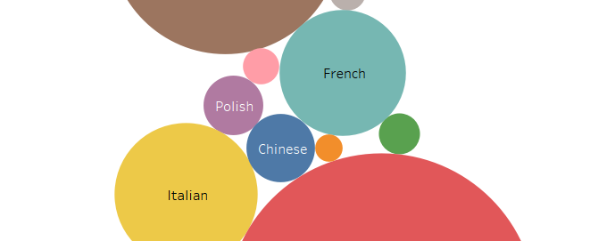
Overall Viewshare is not too bad; it could be even better if you are using smaller and simpler data sets. The map and charts, when functioning properly, are very user friendly and interactive which was our main goal when presenting our data.