 Mapping languages can be done in geographical space. We can map a language’s “homeland.” For instance, English spoken in the United States arguably has a historical and geographical origin located on the other side of the Atlantic Ocean. One of the world maps that appear cyclically at the top of this page and shown as as thumbnail here does just that.
But languages can also be mapped cognitively. In this small data set, we asked students in a Linguistic Anthropology class to “write all the languages that they know—one language per index card—and to say something about each language.” Some stated how they learned a particular language, while others reported how well they understand, speak or recognize it.
The world map that cyclically appears at the top of this page (and shown as a thumbnail here) was generated using all the languages within the experience and/or awareness of the students in a college classroom. This is a map that extends languages enumerated in a specific location, the Mid-Atlantic Eastern United States, into a multi-sited global space where each language is understood to have originated.

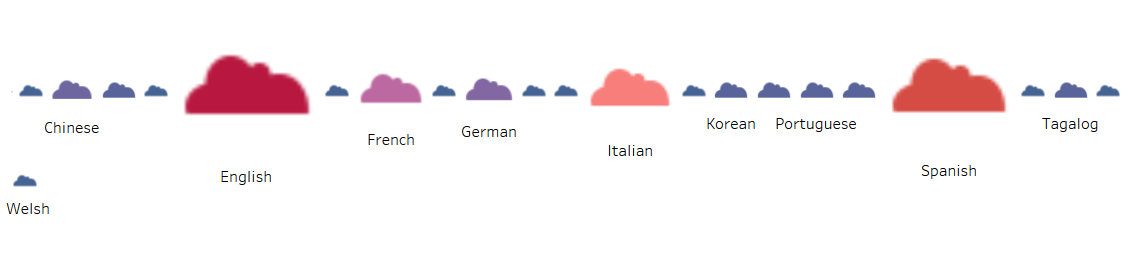
Mental maps of language also emerge. In the first round, thirty students wrote out seventy cards. This stacked bubble graph* shows all the languages listed, with the largest circle showing the most frequently listed language. We see that English appearing in red has the biggest bubble, Spanish follows as the next largest brown sphere with subsequent counts of Italian, French, Tagalog, Chinese, Creole, Greek, Polish and Portuguese. If you hover over the fields, you will see the number of students who counted a particular language as part of his or her social space. The picture represents a kind of cognitive map of languages that are foremost in the students’ awareness whether as speakers/users or as hearers/bystanders. Compare to the languages listed by the same students at the end of the term: in eighty cards, how has the the picture changed? Not only did they come forward with more languages, most of which were in their awareness all along, but they also provided a great deal more detail on the languages themselves.
Meanwhile, when we think about a shared language, do we conceive of it the same way? When asked to say something about a language, the richest descriptions given were for English and Spanish.

In this tree map graph* that looks like a wall of color, the size of the area also represents the frequency that a language was mentioned. Like in the bubble graph above, English appears as the largest field in red, followed by Spanish in a brown field, with subsequent counts of Italian, French, Tagalog, etc. Within each polygon we see verbatim regional descriptors that has the most detailed and place-specific information for English.
What did the majority of respondents, all of whom were American college undergraduates and majority English speakers, have to say about the English language? Most addressed their facility in speaking and understanding the language and provided the richest descriptors. We plotted these in a language cloud using verbatim statements. Compare this to the descriptors for Spanish that had fewer word tokens but similarly addressed their proficiency; the verbatim statements were plotted in this stacked bubble graph*.
*generated using Tableau Public
Want to learn more? Here are other useful websites for mapping languages as well potential sources of data:
US Census via PolicyMap: Languages spoken at home (41 languages)
Aschmann’s American English Dialects
Europeans in the EU and Their Languages
Glottolog (the most comprehensive and most user-friendly database of world languages we’ve found!)