
Is your blog’s theme responsive?
As of last month, Google began penalizing sites that didn’t have a responsive design. When users ran a search on a mobile device, pages that weren’t responsive were pushed down in favor of sites that were. And more readers are using mobile devices every day. Your blog probably gets between 20% – 35% of its readers that way.
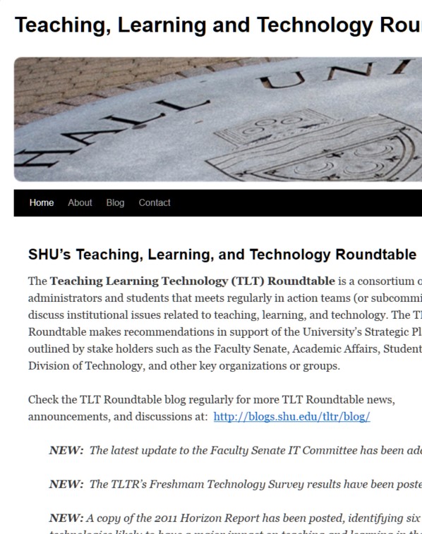
So what’s responsive design and what are we doing about it? Responsive design boils down to the simple concept that a web page responds to the size of the screen on which it’s being viewed. Some examples will demonstrate best. Here’s a blog page that is not using a responsive design:

Twenty Ten Theme, full size
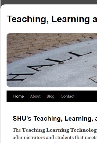
But when viewed on a tablet, it looks like this:
Twenty-ten as seen on a small tablet.
And on a smartphone screen it’s even worse:
Twenty-ten on a 320px wide smartphone screen.
You can see for yourself pretty easily how your site responds to small screens without even using your phone. Just grab the edge of your browser window and progressively make it narrower. Is it still readable? Does it make sense? Where do the sidebars go and what happens to the menu?
Typically, the sidebars go first: they’ll simply drop down below the main content. And your menus will at some point be replaced with the well-known “hamburger” icon — the one that looks like an equals sign, but with three horizontal bars.
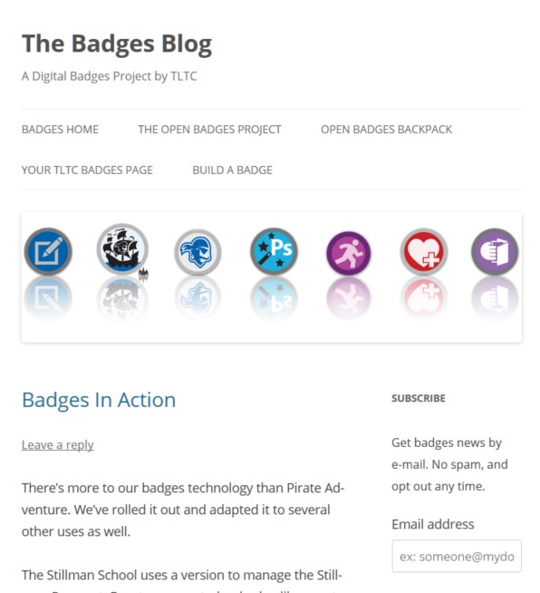
Here’s the Badges blog, which runs on the twenty twelve theme. First, full size:

Twenty twelve theme, full screen.
On a small tablet, the image shrinks as does the width of the two columns. The menu also wraps around onto two lines:
Twenty twelve on a small tablet screen.
And on a smart phone, the sidebar wraps underneath the main text (so it’s not visible here) and the menu is replaced by a button that says “Menu.”
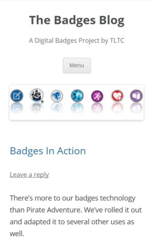
Twenty twelve on a smartphone.
Clicking on the button opens your menu for you:
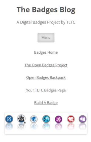
Twenty twelve responsive menu.
And of course, clicking again snaps it closed.
Which themes are responsive?
Most of them, actually. All of the Twenty-something series except for Twenty Ten, all of the Elegant Themes products, and most of the newer ones.
OK, then which ones are not?
Twenty Ten is probably the most-used one on our installations. That includes some of the child themes based on it, SHU-Custom and SHU-10.
Arras and Atahualpa, two popular news magazine-style themes, are not responsive. Neither is Graphene. There are others, but mostly they aren’t being used by many blogs right now.
So what’s to do?
We use the WP Touch Pro Mobile plugin system wide, which will automatically replace these themes with a mobile-friendly version when it detects a mobile device. You’re safe, though the branding can be a little iffy. The default colors aren’t great, and it takes a little bit of decision-making and customization to make them look like your desktop version.
For the blogs using responsive themes, the mobile plugin is disabled. Here’s what to do if you switch themes and find that you’ve crossed over the line. Go into your WPtouch Pro menu in the left column and select “Core Settings.” Then look for the block “Display Mode” and check the box you want:
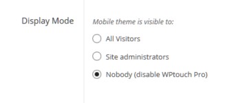
Save your changes at the bottom of the screen.
In Short…
Take a look at your blog on your cellphone or tablet? Do you like what you see? Does it “feel” right, like it belongs to you? Then you’re good.
If you’re not, consider switching to a modern theme. You’ll get more consistent branding, a better user experience, and you’ll probably gain more features as well.
Comments