
As more and more people make their mobile device their go-to device, your blog needs to be ready to work there, too. According to our latest stats, as many as 20% of your readers could be coming to you with a handheld, and for the most part the typical web site just doesn’t handle them well.
Your blog theme may support mobile devices out-of-the-box by using responsive coding. More on that later. But it may not, and then you’ve got a poor user experience.
Fortunately, we’ve got the WPtouch Pro plugin activated network-wide on blogs.shu.edu. Out of the box it presents an … acceptable view. But it can be even better. Here are some of the configurations you can make.
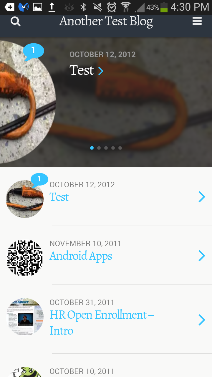
You’ll be working with the WPtouch Pro screens, which you’ll find in the menu down near the bottom of your left-hand sidebar. Here’s the desktop version of the home page of our test blog. Notice a couple of things — the menu (a default menu, not a custom one), the featured images, the sidebars.

Bauhaus
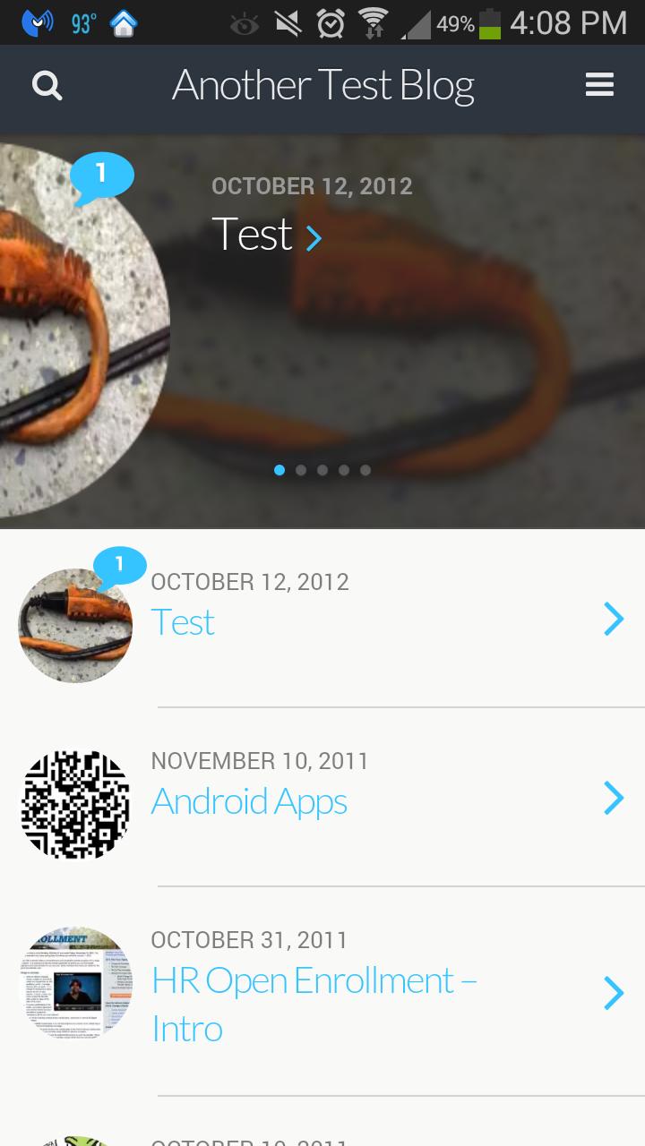
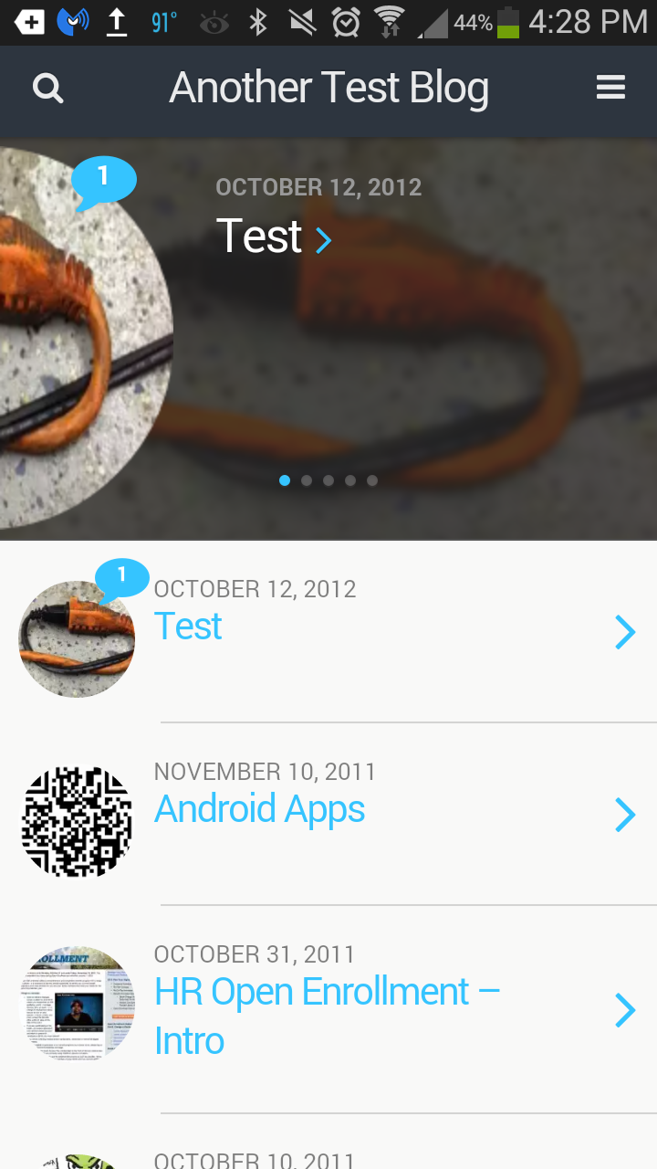
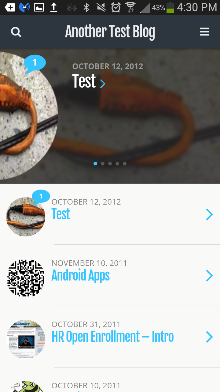
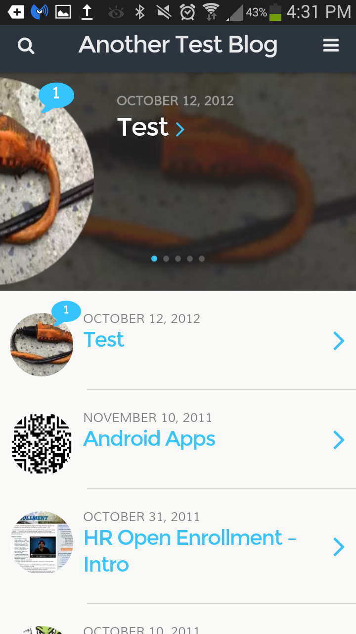
The default theme that WPtouchPro gives you is called “Bauhaus,” and it’s pretty good for this blog. Notice how the featured images become the icons on the left. The slider across the top is generated by having posts flagged as “sticky.” And the number of comments on each post is marked by the blue bubbles. All in all a pretty nice package for a mobile device, but it requires some setting up:
- Featured images on all posts
- Sticky posts to populate the slider
Notice the top bar — just the name of the blog.
You can go simpler. If you don’t have the featured images, you’ll see the dates of the posts in the circles instead. If you don’t have a slider, that section of the page disappears.
The default setting for the banner is the plain bar, as seen above, with the magnifying glass for search and the three-lined “hamburger” icon for a menu to pop up. But you can upload an image instead. Bear in mind that this image will replace the name of your blog — so you need to have some legible text in there to identify yourself!

You can add a banner by going to the WPtouchPro Theme Options page, Branding tab.

Bauhaus gives you four color areas to customize there. The first is the background — everything that’s white including behind the test. Header & Menu control the area behind your banner, behind the pop-down menu, and (if you don’t have featured images) the background color of the circles that show the post dates.
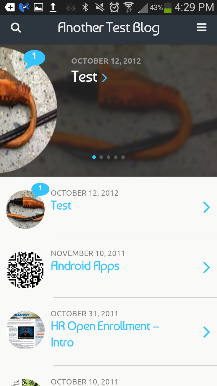
Links controls the color of the text links (“Test,” “Android Apps similar to Android casino games apps listed here androidcasinosites.net which can be played through Android devices” in the first example). Personally I think the default is too light. #004488 (Seton Hall’s official web blue) is better. And Post/Page headers controls what you see once you click past the home page.

The font choices are worth a little bit of investigation. Besides adding a little personalization, some of them add a functional dimension. The example above uses Lato & Roboto, but here are the others. Click on each to see a larger version:
-

- Browser Fonts: What’s built in to your phone.
-

- Droid Serif & Roboto: Tight letterspacing in a serif font.
-

- Baumans & Ubuntu: Quirky and rather Bauhaus-y. The date text is nice and open.
-

- Alegreya & Roboto: A more modern serif font.
-

- Fjalla One & Open Sans: If your blog title is long, this is the one for you — The condensed headline font shows a lot of characters.
-

- Domine & News Cycle: A Times-like healine font, and a very condensed date font.

-

- Montserrat & Munti: A modern headline font, with a nice wide date font.
If your blog title is too long, you can make a mobile-only version of it. No one will ever see “Seton Hall University Photographic Resources” all the way across an iPhone screen, so shorten it (in the “Core Settings” tab) to something like “Photo Resources.”
Lastly, don’t let it go with the default menu in place. It will simply show a list of all your pages. If you’ve set up a custom menu — and chances are you or someone else has — go into the Menus tab and pick the one that’s most relevant.
Much of the rest of this you can figure out. The important points here are:
- Pick colors that work for your and the purpose of your blog
- Make a banner image if you like, but be sure it’s legible
- Pick a font set that works for the length of your posts
- If you don’t use a banner, be sure enough of your blog title can be read.
- Get the right menu.
CMS
Install and activate the CMS theme, and it offers even more. The default theme color for the background is bright red, and you’ll probably want to change that because it’s the color of a certain university down in New Brunswick. You get the slider (though it lacks that nice circle effect) and featured images here, just like in Bauhaus, only if you do not have featured images set up in your posts you’re going to get an ugly generic picture instead.

There’s also support for two menus, which you can rename, and a sliding bar that contains all your categories. Just swipe right-to-left to see them. Here it is with one of the menus popped open.

CMS offers its own set of font pairs:
None of them have condensed header fonts, which is too bad.
A couple of salient points then for CMS:
- You’ll absolutely need featured images
- Pick your colors and fonts wisely
- Use two menus if you have them; but give them names
- Populate the slider with “sticky” posts
Classic
The classic theme is similar to Bauhaus, only simpler. The circle motif is replaced with squares, and the slider is simpler in appearance — quite possibly a good thing, depending on your content — with less obtrusive titles and dates.

Here, clicking on the down arrow next to a posts title shows you the excerpt, clicking on the title itself gives you the full post.
Options include a custom header, three color choices, and five additional font pair choices.
Simple
Is similar to Classic. Options include a tiled background image as well as a logo, yet another set of fonts (here shown with Dosis & Droid Sans), a featured slider and two menus.

Open
The Open theme is designed for retail and restaurant sites, designed around just highlighting your pages.
If you’ve got a site that is just a few pages, this may be what you want. You can have a fairly large branding header, followed by a list of your important links.
There are a few options here that other themes don’t have. You can have a separate logo and background to your banner. The logo, unfortunately, is surrounded by a white box; but with a little planning you can design your background and logo together for a nice view anyway. There’s a lot of screen space devoted to the header, so you really ought to make use of it with a nice background image.
It will wrap your blog title, so you don’t have to shorten it to fit on one line, and you can also show a tagline, which most blogs have.
There are also a few new font choices. This shows Patua One & Alegreya Sans.

Things to watch:
- Be sure to turn off the built-in hours feature on the main settings page, and consider whether you need the call to action section.
- Source out a background and possibly a logo to make best use of this layout
- Fonts and colors, though less critical than other themes
- Use this mostly if your site just has a few pages of information. It’s not a great blogging platform.
Scaffold
Scaffold is provided as a template for theme developers. At some point in the future it might be nice to explore, but we won’t demo it here.
Responsive Themes
“Responsive” themes pay attention to the size of your screen. By moving, hiding and rearranging elements it provides a different view for screens of different sizes, from full desktops down to smartphones. If you want to test your theme for its “responsive-ness,” narrow down your browser window and see what happens. A good example is this one, which uses the Twenty Twelve theme: Watch as you narrow your browser window — the main image shrinks to stay visible, eventually the left column disappears (it’s still there, just beneath) and the menu turns into a button.
If that’s the case and you like what you see, from the Core Settings tab on your WPtouch Pro menu, just select Display Mode::Disabled. The new default theme from WordPress, Twenty Fourteen, is responsive, and many of the other new ones are too.

In conclusion
The plugin gives you a lot of ways to have your own distinctive look-and-feel on mobile devices, ways to go beyond the generic without sacrificing any of your functionality. Take some time to explore your options — it’s easy to change a setting or two, then refresh the view on your cell phone. If you don’t like it — change it back!
Thanks for this, very helpful because 63% of my website visitors using smartphones.
Certainly the mobile visitors are becoming very important and one has to concentrate on this portion of traffic as well. WPtouch is a nice plugin with lots of options.
This is awesome. On our site, we have lots of readers from Africa. Unlike the USA, 90% of Africa is using their mobile phones for everything. We’ll give this plugin a try.
What do you do about adsense so it is responsive?
We don’t use Adsense, so I can’t help you there. WPTouch Pro has a plugin, “multi-ads,” that might address this.
Thanks for this, there are some pretty good free responsive WordPress themes. I finally upgraded my non-free one to get responsiveness. It’s good to know that a plugin can work too. The stats even show what OS, screen resolution, and sometimes which mobile device your visitors are using!
I ran into that problem with my wordpress recently. It isn’t entirely mobile-ready yet, but I’m slowly tweaking the theme to get it there
Anticipating with responsive design and mobile ready theme is crucial. Any beside wp touch plugin do you consider better using for mobile ready theme? Thanks in advance.
If you’re not using a theme that’s already responsive, there’s a free version of WPtouch. It has most of the functionality, and only the Bauhaus theme. You can find it through WordPress dashboard plug-in screen.